
As colleges and universities entered into the first year of the new filing timeline for the Free Application for Federal Student Aid (FAFSA), there were a number of questions and concerns swirling in the minds of enrollment managers as they headed into the 2017 admission cycle.
- Will returning students adjust to the new timeline?
- Will previous awarding strategies of limited funding sources still work?
- How will new applicants behave differently than they have in previous cycles?
- How will this change our application volume and enrollment predictions?
Since more than a year has passed, how do we look back to see what impacts this change in timeline had on student behavior, both new and returning?
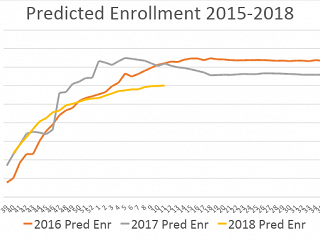
One analysis that was conducted on my campus was to look at a week by week snapshot of application data and enrollment prediction data for 2016, 2017, and the current cycle. As the chart presented indicates, beginning in week 39 of the 52 week calendar year, an assessment of the patterns of student behavior that most impact enrollment were graphically represented through predicted enrollment.
By mid-November (week 46) we noticed a dramatic uptick in the enrollment prediction for fall 2017 as thousands of FAFSA records flooded into the system. In addition to this change in timeline, we noticed students were also doing other activities that are measures within our model much earlier than in years past. This combination of factors made for a very cautious winter heading into fall 2017 as our predictions were running significantly higher than previous cycles.
In a typical cycle, the peak of prediction occurs around week 15 or 16. In 2017 prediction peaked at week five and began a steady decline until May 1. While tracking multiple factors such as applications, gross admits, net admits, and deposits, it became clear that the 2017 pattern was a bit of an outlier and fall 2018 is behaving much more similar to previous cycles. Steady increases in each of the metrics continue to occur in week to week comparisons between the two cycles, which is similar to the patterns of 2014, 2015, and 2016.
As changes are introduced into the cycle, it is essential to look beyond year to year comparisons in determining the flow of how students move to enrollment. While it is critical to be cautious of assuming correlation is directly related to causation, the more angles you can view an issue, the better perspective you are likely to have. In our case, we believe that early reaction and response that may be credited to the new FASFA filing timeline may be a one-year phenomenon. What does that data for your campus tell you?
Analyzing data, data patterns, and trends over multiple years can often help to provide insight on things that are occurring and allow for timely action to ensure the Enrollment Management team is working to meet institutional enrollment goals.
By Dr. Brent Gage, Associate Vice President for Enrollment Management, University of Iowa and AACRAO Senior Consultant.